Site navigation
Site navigation appears at the top of every page on your site. It gives links to pages in the site, sometimes ordered by topic, task, or user type. This makes it easier for people to navigate the website.
There are two options for each site navigation item:
- A link to a page
- Text with a dropdown menu of links
State Web Template navigation types and variations include:
- Single level menu
- Dropdown menu
- Megamenu
- Icon menu
The site navigation component is made to switch between desktop and mobile presentations. On desktop, the top level links or text are arranged across the top of the page. On mobile, they are in a hamburger menu that people select to expand. The links in the hamburger menu are stacked.
Single level menu
This page is using the Single Level Navigation. This navigation style does not include a dropdown for sub navigation items.

HTML Source code
This style of menu can be set by including the
.singlelevel
class in the
<nav>
element like this
<nav id="navigation" class="main-navigation singlelevel"> .
Dropdown menu
Dropdown menu is using the dropdown sub navigation.
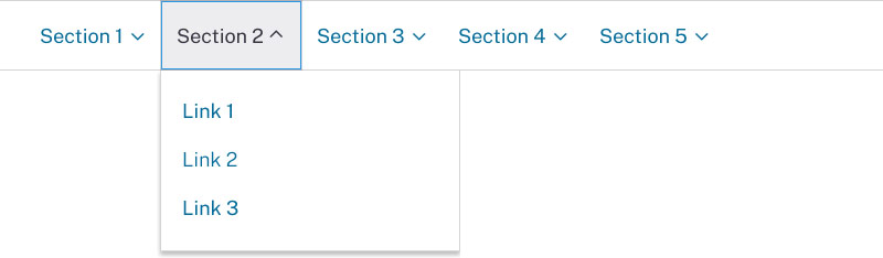
The
.first-level-link
that contains sub-navigation does not require the
href attribute because the functionality of the first
level link in this case is to toggle the sub navigation.
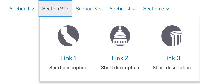
Megamenu
The flex megamenu displays dropdown panels for sub navigation when the user clicks on a primary link.
The
.first-level-link
that contains sub-navigation does not require the
href attribute because the functionality of the first
level link in this case is to toggle the sub navigation.
Inside
.sub-nav
container use flexbox row div
.second-level-nav
with class
.flex
added to it. Class
flex
will ensure equal inline distribution of
a
sub-navigation items inside of
.second-level-nav
div.
Markup example:
<div class="sub-nav">
        <div class="second-level-nav flex">
            <a href="/" class="second-level-link">Link 1</a>
            <a href="/" class="second-level-link">Link 2</a>
            <a href="/" class="second-level-link">Link 3</a>
        </div>
    </div>
To add border around sub-navigation link units add class
.with-border
to the
.second-level-nav
div container.
Mixed Content Within Navigation
The megamenu allows for the display optional icons or images with
sub navigation links. It is also possible to display a short
description below each sub navigation link. To display icon on top
of the link use
span
with appropriate ca-gov-icon icon class from our CA Gov icon font
library. To make an icon bigger use desired font size class such
as
.font-size-40. To display small images on the left or
right side of the link use
.with-image-left
or
.with-image-right
on the div container containing the media.
Link with large icon markup example:
        First Link
        Some link description.
Link with left image markup example:
 News Title
Icon menu
Navigation with icons usually appears to the right of the site logo. It uses icons from CA.gov font library inside of the first level navigation items.
HTML Source code
Structurally, navigation with icons is set up differently than full width navigation. The code samples bellow show the difference between them.
Navigation with icons markup:
<div class="navigation-search">
      <-- Navigation component code goes here -->
      <div id="head-search" class="search-container">
       <-- Search component code goes here -->
      </div>
     </div>
Full width navigation markup:
<div class="navigation-search full-width-nav container">
      <div id="head-search" class="search-container featured-search">
       <-- Search component code goes here -->
      </div>
      <-- Navigation component code goes here -->
     </div>
Usage
When and how to use it
Use site navigation to help people find pages on your website. It should list or lead to the most helpful content on your website.
Links can be organized into sections or can stand alone. Sections can be organized by:
- Top tasks
- Major topic areas
- Audience or user groups
You can use a card sorting activity to determine what should go in and how to organize your site navigation.
How not to use it
Do not overload the site navigation with too many pages. And avoid using more than a handful of navigational items. This makes it difficult for people to find what they're looking for. Make sure any pages not in the site navigation can be reached through a page in the site navigation or the site footer.
Do not link to PDFs or external sites in the site navigation.
Accessibility
Standard accessibility review
Each time a new component version is published:
- Test with the Axe accessibility tool
- Review with the VoiceOver or NVDA screen reader
- Ensure all actionable elements are accessible by keyboard command and tab in a logical order
- Check the component layout on a variety of screen sizes