Footer
The footer is a structural component that puts the state's standard footer at the very bottom of your site. Having a common footer tells people that the website is an official product of the State of California, which increases user trust.
The footer contains a set of links that go on all the pages of the website.
The footer always includes:
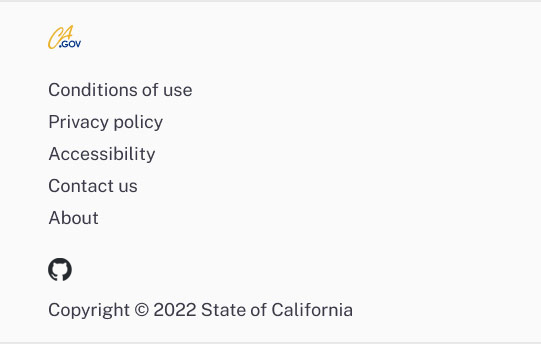
- The CA . gov logo on the left that links to the CA . gov site.
-
A set of standard links:
- Conditions of use
- Privacy policy
- Accessibility certification
- Contact page for your organization
- The copyright notice.
The footer can also include:
- An optional logo on the left that links back to the homepage for the website.
- Customizable links.
-
Social media icons that link to official social media accounts. These
could be for a department or a campaign. The available social media
icons include:
- YouTube
- GitHub
Sample
Desktop

Mobile
HTML
Usage
When and how to use it
The footer goes on all pages of your website.
Examples of links that go in the site footer include:
- General department info
- Department accessibility information
- Careers page
- Contact page for the site
Make sure you do not duplicate link text in the footer. Using different link text that takes visitors to the same place confuses people and causes accessibility issues.
Link the social media icons to your official social media accounts.
Provide a contact page that's relevant to your site.
How not to use it
Do not use the site footer:
- For primary calls to action
- For information to primary user needs
- As secondary navigation
Do not add other elements to or change the footer. Use it only as designed.
Do not send them to the general CA.gov contact page unless it's appropriate to do so.
Do not include more than one social media account per platform.
Accessibility
Standard accessibility review
Each time a new component version is published:
- Test with the Axe accessibility tool
- Review with the VoiceOver or NVDA screen reader
- Ensure all actionable elements are accessible by keyboard command and tab in a logical order
- Check the component layout on a variety of screen sizes